Saturday 31 January 2009

Treasure


This is a book a found in The Bookshop in Winton. A store that sells a variety of books around different subject matters. Especially their poetry and philosophy sections are good. It is often visited by Arts Institute students and if you buy a lot of books you get a discount to the already cheep books ( usually costing about two or three pounds ). This is a refreshing, exiting place, where you can really find interesting and unique pieces of art, that you could never find in major bookshops.
My found The Rubaiyat of Omar Khayyam is a perfect canvas for my picture book. I like the size of the book. The thickness of the paper is perfect and it is not too big or thick for me to fill. I will give the book a new meaning and create something even more presious!

Possibilities are endless only time is limited

Yesterday Hayley Potter started our day by giving us a lecture about her work and the industry of illustration through her experience. She showed her sketchbooks and books she illustrated and wrote. I found this particularly interesting, because this is exactly what I am doing for my Professional project. During her talk I asked her about her approach of doing a book. Does she write the story first and then based on it, generate the images or are the images that she draws influencing the written language. She said that every case is different and that there is not just one right way. I agree.

Later on that day I had a talk with Hayley about my ideas, showed my earlier work and discussed how to get started. She gave me many good advise, people I should look up for refrence, research and inspiration, some of them new to me, some already " old friends" ( Su Blackwell, Sara Fanelli, Mervyn Peake, Andrzej Klimovski ). We talked about how how to pinpoint my target audience, something I was worried about, since we have to explain this in our learning agreement. She advised me to look at artists books collectors and authorial illustration. To getting started she advised me to set myself a page limit in writing ( since I am not sure if I will write something completely new or use an old text I have already written. In the latter case, I will alter the text to suit my present taste ) and to generate more images I plan to use, so I have a large stock from where to choose.

I am still wondering how to get started. I have the concept, but whether to start writing first or drawing. To this Hayley advised try both. The best way of working for me, will come along the process.

This is my wall


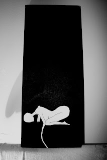
A blank canvas for my Professional project. By 8.5.2009, it will filled with images, text, research, inspirations, realizations, feedback and wrong paths I took. To make my most important project so far always present, I will dedicate a wall to it.

Friday 30 January 2009

Professional project

Yesterday we where briefed on our final major project. The morning started with Dan giving us a lecture on what we should be thinking of when starting this project, writing our learning agreement and what we should do to meet the learning outcomes.

Like I earlier said I have been looking forward to this project. A lot of freedom to create, a lot of work, a good amount of time and hopefully an outcome that is unique, something that pinpoints what I am as an artist and something that will get me recognition and potential clients attention.

During our briefing Dan gave us an exercise, some questions to answer about yourself as an artist;

What are your strengths/what learned:

- Illustration, generating images
- Thinking outside the box
- Team work, collaborating with other areas of art, using other peoples skills
- Coming up with ideas
- Self reflecting
- New technical skills, Photoshop, DreamVeawer
- The importance of backup research
- The importance of "philosophy" behind an image

Preferences:

- Illustration, book illustration, hand drawn art
- Combining art forms, mixed media, illustration+words=books, illustration+music=animation/music video
- An idea behind an image
- Keeping away from mainstream, thinking outside a box

Where do you want to be:

- Collaborate with different people in different areas of art, feed from others creative minds
- Editorial illustration, images interacting with words, images explaining words

What type of work to produce:

- In general: work with layers, in meaning, not just generate "flat" images that have no meaning
- Work that stands the test of time, but interesting at present
- For professional project: unique, individual work

I am set on an idea in my professional project. I am going to produce a book. Write a novel/short story, make the images and bind the book together. My end product will be three different books, the written language, the images and the final product coming together.

Tuesday 27 January 2009

Inspiration for my professional project


Birdland by video artist Takagi Masakatsu. Combining two medias together. Imaginary and music by Masakatsu.

Monday 26 January 2009

Some early sketches for Malte Hubners film. The tone of the film is dark, colours black and white, ideally shot on black and white film. The style in which I am working on is 1920`s Art Deco. Geometrical shapes, simplicity, black and white. The theme is still quite loose and will develop more along side the films narrative.

I will be helping helping creating a three different walls for different scenarios. Each one of those scenarios will develop the story further and will gradually make the tone of it darker.

Truly interesting opportunity and definatly something I think I can influence with my style. I think the visual look of the film is something very important and my style is perfect for this project!

Set design


Time table for this week

MONDAY 26.1.
- Sketching for set design for Malte Hubner`s ( second year ) film.
- Meeting about the visuals at Malte`s house at eight o`clock.

TUESDAY 27.1
- Reseach on professional project.
- Further development of visuals in Hubner`s film.

WEDNESDAY 28.1
-organize a D&AD meeting.


THURSDAY 29.1
- Briefing on the professional project.


FRIDAY 30.1
- Professional project.
- D&AD.

Friday 23 January 2009

Hand-in

I am done and it feels good! This has been an intensive unit. I was writing my self evaluation yesterday in the library. It made my realize how much thinking and self reflecting this project have required of me. This project has made me think more about my future as a designer then any other.

What kind of illustrator do I want to be? I am still not sure. As the course goes on and we learn new things in the field of visual communication, I can limit myself little by little and say what I don`t want to do. A couple of days ago I went to listen to the third year illustrators, who where on second year viscom last year. They told how the course is much about self disipline, in terms of learning and that the tutorial time is limited. I think this is something I cope well with. I am really looking forward for the third year. Before that I want to make clear where I see myself in the field of illustration. By doing research around illustration, exploring more where my images could fit the best and where my natural interest lies, will hopefully help me define that.

I am looking forward to the professional project. Complete freedom to create to go crazy! I already have some ideas of what i want to do, but I need to explore more to get the project perfect for me. We have a couple days of to recover from our website project before we start our final major project. In this time I will do some research on my ideas.

I am also working on a third year grad film, taking HDR images, helping a second year film by making the set design and creating the visual look for it. Today I have to go and record my voice in post production for the film Thug of War, in which I was acting in last year. As always these projects keep me busy and focused.

Thursday 22 January 2009

A lot on my mind

Almost done with the website project! I truly am ready for new things and cant wait to start our professional project. I am already going through ideas in my head. So many possibilities and a lot of freedom to express yourself.

But holding myself back for a while and focusing on the website. Looking at the final site I am fairly happy with what I created. It is a simple site, which is easy to navigate and the focus is on the images; my illustrations and photography. The site reflects what I am as a designer, it reflects my style and focuses on illustration, which is my business.

This is my first try ever making a website. Starting the project I felt really intimidated working on something that was so unfamiliar for me. I was also dissapointed in because I was told I couldnt do a recap on Dreamveawer. I did my Dreamveawer course in the end of last year and that left me with little help. Even though going back to my notes gave me some help, a large part of this project have been about watching tutorials in the internet and asking help of friends.

I will not put my page to the web in this form. After the hand in, I want to go back working on it and do some changes. I feel that this is the beginning, I am just starting to understand how the web works and now with my understanding I can take my ideas and design further, to communicate to the viewer exactly what I want to say.

Tuesday 20 January 2009

Something from home!


When going through finish illustrator Jaakko Pallasvuos website, www.jaakkopallasvuo.com, I found an interesting agency, located in Helsnki, Finland. It offers variety of quality work and shows the latest trends in illustration. A site worth checking out.

www.napaillustrations.com

By the way napa means bellybutton in finish :)

The morning starts of with an omelet accompanied with working.

The plan for today is to make my web page as finished as possible so I have good time to give Neil the files and get the page actually ready and working for internet. I am also going to use the big printer to test out how some of my creations about solitude ( posted earlier on my wall ) would work in a bigger scale. I am keen to try on different papers and see the effects of it.

Yesterday we had a meeting with Catell to show our development on the D&AD brief. I brought in the artwork we did on our meeting on Wednesday ( posted earlier on ). She liked the textures and images we generated. The advise we got was to look more into other artists who work on layers and combine different styles. We where also advised to work more into a set theme, something we already knew and to replace the black with a softer colour/colours to make the piece less dark. All and all our first session was succesfull and a good base for our tomorrows and Sundays meetings.

One of the artist Catell refrenced to was a fellow countryman of mine illustrator Jaakko Pallasvuo.

www.jaakkopallasvuo.com

He uses different textures and different shades of the same colour in his work. His work consists of very detailed parts and also in contrast paint stains that look like they have just been thrown into the canvas, in a very unfinnished matter. What inspired my about his work, was his comic strips. How he combined images with writing, making it interesting and a art piece by it self. With the inspiration I got, I tried out working in this way knew to me. It gave me some interesting results. I have always struggled to use type in my work. For me images should be enough and explaining them unneccessary. But working on a comic strip, when the type is not in focus itself, but working alongside, together with the images, I find it very interesting. Also the element of crating your own worlds within ten or so frames is appealing to me. This is also something very different from what we usually do on our course. Not working on a set brief with a lot of restrictions and having to think about how to sell the "product".

Sunday 18 January 2009

JOOT created late one night


Solitude

Sunday spent with Dreamviewer

I have been ill for the couple of days and really haven`t been able to work proparly on my web site. So today, when I finally felt a little better, was a day packed with coding. The way I have been approaching this project have been about good planning. Before I ever started to my create my website I did very detailed sketches and roughs about every single aspect of the sight. So that when I reach the point where I have to put it all together, ( which I knew was going to be a tiny struggle for me ) I am well prepared.

I chose to use Dreamveawer instead of Flash after doing some research about it and asking from people who are have worked on the field of web design. What I learned was, that Dreamveawer would be the best choise for my design.

One of the things I have learned during this project is the many possibilities to do the same thing. I started doing my index page by inserting a table to the actual view of the page and placing elements, buttons, etc to the table. This didn`t really work that well, since when taking the view to the web, ( safari ) and pressing the mouse, it showed the brackets I created and this was not something I wanted. So I took an another approach and started coding. What I have done so far is created the look of the index page, copied the layout to the illustration page and photography page to keep the look of it identical. I created an illustration gallery, made thumbnails of the images I want to have. And I made my logo JOOT as the navigation button to come back from the illustration page and the photography page to the index page.

Problems I faced today, where with positioning the links in the right place on the index page. I wanted to line them underneath each other and this turned out to be a big task. I alsoa leaded that there should be no spaces between the SCC code, because this might slow the page down. Many thanks to the wonderful and patient Matt Lewis, who was there to answer my countless questions!

I still need to do put more images to my illustration and photography gallery, make them open up bigger, as light boxes and get some web space to put the site into the web. I also need to finish my sketchbook and photograph some of the illustration pieces I am working on at the moment. To my understanding of the web and how people are looking at the things in it, I am reading two books by Ed. Julius Wiedermann; Web Design: Portfolios ad Web Design: E-Commerce.

Friday 16 January 2009

Something for the Friday night

Quote from Emotional Design by Donald A. Norman

" Beauty is good, succesful products should be pleasurable to use and convey a positve sense of self, of accomplishment and pride of ownership. "

Notes on creating a website

- Important to gain the technical skills, still a lot to learn for me.
- Getting your own style defined, website being an extension of who you are as a designer.
- Getting your work accesseble to a lot of people through the web, creating links and contacts.
- My personal style, strong, unique. Last year I felt it was working against me, the fact I already had a strong style. This year it is all about you as an individual, unique, differant artist.


SOME POINTS TO REMEMBER
What is being assessed or looked at on a website:

- Accessability
- Content
- Audience analysis
- Navigation
- Brand communication
- Copy writing
- Information architecture

Timetable for the coming week

FRIDAY 16.1
- Create personal pieces for website.
- Design website further.
- Finish sketchbook work.

SATURDAY 17.1.
- Create personal pieces for website
- Design website further.

SUNDAY 18.1
- Meeting with Matt Lewis, to get some help with my website.

MONDAY 19.1
- Meeting with Catell Ronca at 12.00, about D&AD ( to show our joint sketching so far ).
- Design website.

TUESDAY 20.1
- ( Painting at the fine Art studio? )
- Design website.
- Meeting with Krister about HDR images for a 3rd year grad film.

WEDNESDAY 21.1
- Meeting at my house with Matt and Allison. More D&AD sketching.

THURSDAY 22.1
- Gathering everything together for the website hand-in.

FRIDAY 23.1
- Screen based media 2 hand-in at 12.30.

Wednesday 14 January 2009


A new piece to Isolation/Solitude. Acrylic paint and pen.

Sketching for D&AD


Creations done on 171 Alma Road. Combining Matt`s, Allison´s and Milla´s style.

Tuesday 13 January 2009

A tiny piece of Heaven and Hell

Today was spent painting with acrylics at the Fine Art studio 3. Heaven; a creative environment, conversations with interesting people, freedom to be messy without restrictions. Hell; devil is in the detail. Perfection is something to aim for, but it is never possible. The eye will never be satisfied.

I arrived at the studio at ten in the morning. To my happy surprise I saw many of my friends at the Fine Art creating their individual, very different pieces. The athmosphere seemed very relax and everyone was happy to share the space. Couple of hours later Matt joined me.

What I wanted to create was some illustrations with acrylic paint, under the theme isolation/solitude. I find this theme interesting, always present and controversial. Isolation/solitude can be a state of mind or something you choose. A person might seek for loneliness or you can end up being alone, something that, at our society nowadays have become more and more obvious. There is also different layers in this theme. A person who lives in solitude, might want to get free from the stress full everyday life and the obligations it demands. Or it might be a state inside your head, feeling lonely, alone in the middle of others. I find the theme interesting, definitely personal and something to find a balance with. How much time should be spent alone? What is healthy?

In my paintings I am creating the atmosphere of isolation and solitude by using a lot of empty space, positionating the characters in the corners of the canvas and playing with proportions.

During the day many topics where discussed between Matt and myself. Not surprisingly illustration, being a hot subject. We where discussing what defines someone`s style. Is a person consiously thinking about making an image look like his or her style? How a persons style develops and how much influence other artists styles have on you.

I think style is something that definately develops and changes with your practise and experience. While looking at a lot of artists, getting knowleble of differant styles you automaticly draw inspiration from them, but I do disagree on the argument Matt raised, that you consiously change your style and lines to imitate the ones you find appealing. I think the development of ones style is a gradual change.

This is of course me talking by the experience I have in my own development. Looking back at my illustrations I can definately see change, or call it development of my voice. In my work I have cut back colour, mainly using just black and white and making lines minimalistic. This is because I think all excess is unnecessary. I want to be able to express myself with as little as possible, providing the viewer all that is necessary to "decode my message". Because thats what it is, when ever I draw something. I am trying to tell the viewer something, without words. My style is no more a consious decision it simply is the way I see the world around me.

Monday 12 January 2009

Progress with D&AD, advise; go crazy!

We had our first meeting with Catell about D&AD. Like I previously wrote, we had a semi fruitful meeting at Matt`s house on Sunday. I had high hopes about this meeting with Catell, because the thing we are missing at the moment is direction. We have our idea, but we all still feel a little lost and the new way of working, as three illustrators together is something we find difficult.

We started the meeting by explaining the brief to Catell and showing some of our sketches and also talking about the difficulties we are facing. She found the project to be a good one especially for people who have an interest in illustration. Her advise to us was to get a big paper and all draw together on it as a team. That way we could feed of each others ideas and creativity and not be afraid of our individual styles not working together. This was also an issue that was raised during our meeting; how to combine three different styles, make the illustration a piece that is equally ours and works as a whole without anyone having to compromise their style or anyones style being too dominant.
So the advice we got was to go crazy! To not limit ourselves and keep our individual styles within the piece we are creating. We arranged a meeting at my house on Wednesday. A big paper, pens, pencils and paints will be used!

This is where I have come so far designing my logo. I made it simpler, only using necessary elements. The logo is a reflection of my personality as a designer and I only use the lines that are necessary to use when creating an image. Less is more.


The director Hendrik Faller sent me some shots from the film Thug of War, in which I played the leading lady. One of the best things studying at the AIB, to me is, the opportunities you get. I think it is great to collaborate and be part of someone else`s vision. I think these years of studying should be used as taking advantage of every opportunity and making contacts with people, who you might work also in the future with.

Sunday 11 January 2009

Today we had our first Sunday meeting with Matt and Allison at Matt`s house about D&AD. The meeting started with us trying to lure Matt`s new baby hamster Momo out of it`s nest. With bad results. Our meeting consisted of brainstorming, discussing ideas and generally sketching what ever came to our heads around the subject area. Sketching for three hour and watching a quick clip of the Simpsons with a screaming caterpillar, gave us something to show for our tomorrows meeting with Catell. The ideas or words we are working with at the moment are, organic, nature, humanize, pattern, mosaic, glass. Still many decisions to do, but we got a good start today!

Friday 9 January 2009


Something interesting.

Thursday 8 January 2009

A little bit of entertainment after a long work day. I found this really impressive music video from YouTube by Scream, Tapped, which combines images and music perfectly! Enjoy!
What a long day it feels like! It is a weird thing to say, all the days are equally long. I have been sitting in front of a computer and designing my logo and website alike. It seems the more opinions, research and though I put on the layout and the look of my page, the more ideas it creates. I also got the inspiration to create my own business card at the same time as I am branding myself.

I had a brief talk with Neil and showed my logo. After that talk I came to the conclusion, that I will simplify it by taking some elements of it. I am also detailing the index page to its final form. Today I alos looked at a lot of web pages to get some comparison. www.webdesing-awards.com and www.designlicks.com have some interesting sites. I noticed that my eye prefers simple layouts and my main focus is on the content of the page. I also noticed how easily I judge a page to be a bad one if something on it doesnt work, downloads slowly or I am strugling to find them navigation.

I also found an interesting page for quotes, www. quatationspage.com. I plan to put some quotes that are meaningful to me on the section about me.

Wednesday 7 January 2009

Today we had our first group meeting after Christmas. Unfortunately my sketchbook is still on its way to England. No room for both of us on the same plane apparently.

After a morning coffee we headed to the library to sketch further. What we are facing at the moment are problems how to combine our skills, style and personal viewpoints. We are also struggling a little with the scale and probably intimitated by the large space, that at the same time offers a lot of opportunities, but also needs a lot of ideas to be filled. We are also very aware of who we are designing for. Our design should be at the same time contemporary and something that will last.

At the moment we are thinking of linking humanity with nature, using patterns, shapes and layers. There is still a lot to do and we need to look more in detail into how mosaic and glass works.

For now on we agreed to meet every Wednesday and Sunday to gather our ideas and sketches and work further on those. We have a meeting with Catell Ronca, to talk about our ideas and illustrations on Monday.


Creating an identity.

Tuesday 6 January 2009


Creating an identity. A page from my sketchbook.


I have been lately listening to Julie London`s beautiful voice. In these posters typography and photography make a beautiful balanced, interesting combination. I always struggle to put type in my work and have a lot to learn on that area. Beautiful colours, beautiful lady!
As I earlier wrote I want to create some new pieces of illustration to my web page, because that is my main focuse in my work. Going through m work when creating an identity for my web page I noticed how much of my work is actually photography based, personal stuff. That is why I feel I need to create strong pieces of illustration outside the course work and usually that tend to be the best, most interesting stuff.

I have been doing mock ups and trying with different type and layout choices for my web page. I am almost there. I have done final decisions on the font and the colours. I have designed my splash page and created my identity by choosing a designer name and a logo that will help me branding myself. Key points on my website are simplicity, easy to navigate and to let the work be in main focus, not the page it self. The galleries will be navigated by light boxes. Looking at some other illustrators website, this seem to be a working, effective way.

The next step is to do some final decisions on my index page, to finalize the arrangement of my logo and my designer name. I want it to look clean, but artistic and to be an interesting introduction to the actual art.
The lecture with Catell Ronca was helpful and straight forward, about the business side of illustration. It is good to hear advise from someone, who has the knowledge and experience, but is also practising currently and is faced with the same problems, that she talks about.

Becoming a freelance illustrator is an ideal for me, but it also has many difficulties, that at least in the beginning of ones career might sound frightening. How to start? Where to get the clients? How to promote yourself? This is why going to lectures like this is helpful and gives you good tips for the future. A lot of self disiplin and courage is needed as well as realizing the importance of networking, with other illustrators and artist alike and potential clients.
Notes from our lecture with Catell Ronca.

How to set up a business ad an illustrator:

- Define your market
Editorial
Childrens books
Advertising ( where the money is )

- Research potential clients
Bookshops, Libraries, Publications
Names of AD:s
What kind of illustrations are used

- Address the right person
Art Directors
Art Editors
Art Buyers
Designers
Picture Editors

- Self-promotion
Create an original piece
Handmade stuff are always better, more value
Concept is important, what is special in our idea and in you

- When emailing
Spell names right
Respect AD:s busy shedule
Send examples
If you want the work back, send stamps
Feedback sheet

- When showing your portfolio
In good condition
Include what is relevant to the client
Commissioned work goes to the front
Only show work you like
Experimental work goes back
Max. size A3
No more then 20 pieces
No sketchbooks
Bring a business card
Ask who they can recommend for other work

- Creating a website
Easy to navigate, simple, interesting
Good websites, Illustration Mundo, Illustation, Coroflot, Flickr, Moonfruit

- Networking
With other illustrators
Keep in touch with people you studied
Regular contact with clients
An exhibition with friends

- When commissioned
Commission in writing
Copyright to you
Agreed fee

- Copyright
Dont give it away ( The little c )
Read the small print
Only sell copyright if it makes sense

- Pricing
What is the illustration used for
How big client
Circluation, how many copies
Area and duration
How big is the budget

Sunday 4 January 2009

Yet an another exciting announcement! I just ordered a book from Amazon called Vossia, by Herbert Baglione. It displays his illustrations and street art. Now it is just waiting for my package to arrive!
Tomorrow we will be delighted with an lecture by Catell Ronca, an illustrator from Switzerland. She moved to London in 1997 to study in Kingston University. Currently she is dividing her time between painting and teaching illustration.

I looked at her website ww.catellronca.uk.co. Her work i devided to paintings and illustrations. The page has a simple layout with a white background. Her work portrays mostly people of different ethnicities. Her use of colour is bold.

www.foggygrizzly.com offers a nice, delightful interview that focuses on her work and on the person Catell Ronca is. She says, that people and colour are the most obvious themes in her work. " My aim is to reflect what I see around me using spots of colour. The beauty of human beings everyday glory and be a casual journalist..... I would describe my style colourful naive and detailed. " Says Ronca.

Lennie by Catell Ronca. My favorite piece of hers.
Here below are some polaroids of Andrei Tarkovsky, that I have been influenced by. During my Christmas holiday I was planning to do something with my inspiration and the results can be seen below in my polaroids, Finland -6 degrees.

These polaroids of Tarkovsky`s are from a book called Instant Light. I found an interesting article/review about them at:

www.sencesofcinema.com

The article is not just interesting, because of the polaroids, in which he has captured well the softness of the images, documenting glimpses of his home life , with a superb composition and framing. They are also also images of his time in Italy.

Obviously one of the facts that these images, beside their beauty is interesting to people is the fact that they are made by film director Andrei Tarkovsky ( 1932-1986 ), who is listed as one of the 100 most critically acclaimed directors. Tarkovsky worked extensively as an screenwriter, film editor, film theorist and theater director. He is known for such films as Nostalghia, Stalker and Mirror. His films are characterised by Christian and metaphysical themes, extremely long takes and memorable images of extreme beauty. Ingmar Bergman was quoted as saying: Tarkovsky for me is the greatest director. the one who invented a new language, true to the nature of film, as it captures life as reflection, life as a dream.

Why I find him interesting, and really relevant to what I study, is the visual stimulants he offers with his imaginary. My personal inspirations comes from variety of different places, film being one.


Andrei Tarkovsky polaroids, Instant Light.

Saturday 3 January 2009

Quotes for inspiration.

" I have imagined so much and had so little. "
H.C.Andersen

" Death is the biggest adventure. "
Peter Pann

" I thought I could organize freedom, how scandinavian of me. "
Björk